Flighty
A personal flight tracking app
Product Design - UI/UX - Illustrations - App Icon
Let's start from the beginning
“There once was a Tweet…“ is probably how a lot of startups started these days. And it was the beginning of the Apple Design Award winning app, Flighty.
In January of 2018, Ryan sent out a tweet, complaining about flight trackers and asking who wants to join him to build something awesome. I did not see the tweet, but my husband did. And as an iOS developer, he answered and was soon the first one to join the newly formed team. So why do I tell you all of this when it is not about me? Because I joined soon after.
The first item of business for the still-unnamed company was to find out if there are potential users for a flight-tracking app. Is there even a need or does nobody but us care about this? Since I like to do user research, I was asked to help with the survey. I gladly obliged. And the survey was a hit. Yes, I am biased, but survey takers even wrote in to tell us that they liked the survey… and that says a lot.
After the successful survey, we got down to business.
Finding what we want to do
To get from an idea to a product, a lot of steps are involved. The first one is: What the hell are we even building?
After a lot of discussions, it was broken down into the following: We want to build a personal flight tracking app that helps people to know what's up and help them navigate through the stressful part of the flight experience. We want to give the best possible data, in the most useful and useable way.
Filling in the blanks
Flighty is all about the data. And when having a lot of data to show, it is a challenge to prioritize and arrange the data in a way that makes the app look calm and simple.
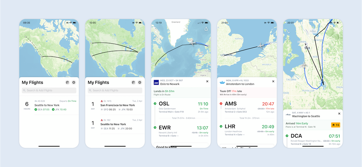
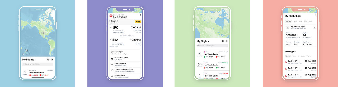
The main Flighty screen is “My Flights”. This view shows all the upcoming flights. A list on the bottom and a map on top.
This custom made world map is one of the main design components. When there is no upcoming flight, it displays basic information like airports. Including gates and runways, if you look closely. Once you add a flight, the map will show the route of your flight. And, as soon as the data is available, you will see an image of your actual plane type on it.
The main functionality of “My Flights” is to show you when your flight departs or arrives, and if it is early or late. For more information, a tab on the flight will open the flight details. And this is where we went crazy.
We want to give you all available information, but in a useful way. So the first thing is to prioritize what data to show where. On top, above the fold, the most important, and beneath that, when the user starts scrolling, all the rest.
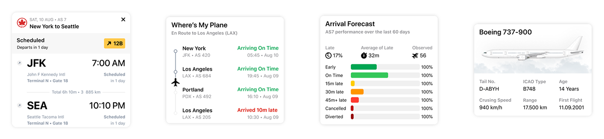
The second thing we did was to look at the data and figure out what the most accessible way is to display this information. We don't just show the data, we pack it and wrap it and put some color on it so you do not have to figure out what it means. For example the arrival forecast. This feature shows data about flight arrivals for the last 60 days and displays it in an easy to consume way with color code and summaries.
We also included data that is not necessary but fun to know. Like the age of your plane, its speed, and range.
All in all, we made Flighty into a powerhouse that uses a simple, clean, and easy way to smartly display data.
Have a look at us
The first glimpse a user gets about an app is its icon. This little squircle item also lives on the home screen, and should be pretty enough so you enjoy having it there.
The Flighty app icon is a white plane on a dark gradient. It is subtle and unambiguous with a high level of detail. Just like Flighty.
And people seemed to like it, it even made it into the first App Icon Book.
Now let the users come!
Once you download an app and open it, you should be instantly able to use the app. Flighty is quite easy to use and has one main screen that will let you easily do the first (and most important) thing: add a flight.
But (yes, there is always a but): Flighty can do so much more!
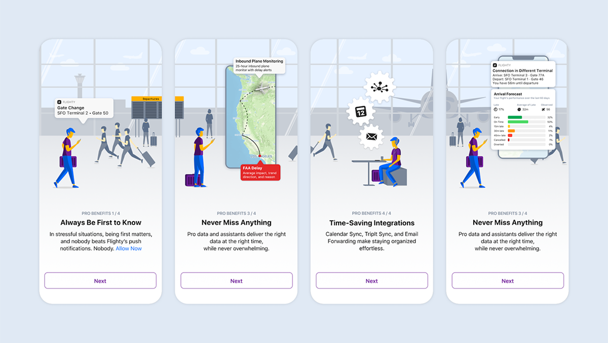
The free Flighty experience is great. You get all the important information and you will know all you need about your flight. But some people want more. And this is where Flighty Pro comes in.
Flighty Pro is an option to subscribe to get more data, link up with your TripIt account, sync up with your calendar, or send in flight itineraries via email. Oh, and notifications.
Because we did not want users to miss out on the Pro experience, we decided to use a quick onboarding to tell them all about it. The 4 screens are based on an illustration I made and feature a person that uses Flighty in the airport and receives all the benefits Flighty Pro has to offer.
And finally…
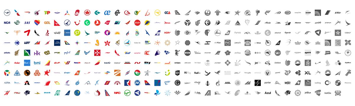
There is always more. In the case of Flighty, it was a few hundred more. A few hundred more airline icons.
When you build a flight tracker, you need to have airlines in them. And since we want to have an easy experience, the airline icon goes a long way when quickly identifying if this is the right airline. We were all set to purchase a nice set of airline icons, but unfortunately, nobody sold what we needed. Either the format or the amount or the price were not right. So, I made them myself.
Now Flighty has over three hundred airline icons in black&white, in color for light mode, and in color for dark mode. So if you calculate it, I made like a thousand airline icons.