Flighty App Icon
Icon for a flight tracking app
Flighty App Icon
The Basics
The first glimpse a user gets about an app is its icon. This little squircle item also lives on the home screen, and should be pretty enough so you enjoy having it there.
The Flighty app icon is a white plane on a dark gradient. It is subtle and unambiguously with a high level of detail. Just like Flighty. But it took us a while to get there...
We had an idea, or more than one...
To find the right app icon for Flighty, I played around with a lot of different ideas. Initially, a "F" as the first letter of Flighty was one of the frontrunner. Easily to associate with Flighty and not just a generic flight app. Other ideas where to use the UI, as in stacked cards and progress of the plane. After the UI was changed, this idea was no longer valid.
And of course there were a lot of different ideas with plane. On different backgrounds. With various colors. From different sides. Even having more than one plane on the icon was considered.
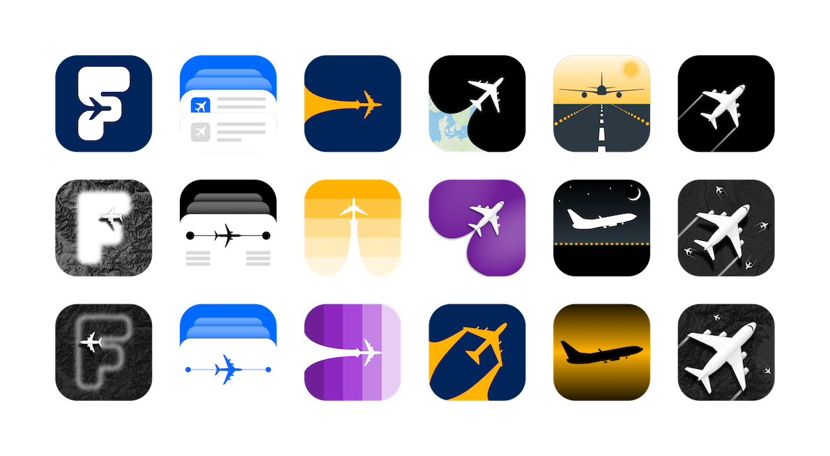
Initial App Icon Ideas
Then there was a plane
Step by step we got closer to figuring out what we want. We decided on this very straight forward app icon to ensure that the icon tells what the app is all about. Furthermore, it was very important that the app icon conveys that the app is a tool for experts and very detail-oriented.
Once it was decided that the app icon should show a plane from the top, I started to go deeper into the details.
First up was finding the right form. I tried several real planes before I decided to create a plane that looks good on the icon, rather than using an existing form. So please do not try to build our Flighty plane in real life. It would very much look like a bumble bee and we all know that they are not supposed to be able to fly.
From there it was adding details, finding the right colors and shades, and deciding on a background. Because Flighty is a pro level tool, a lot of details were added on the plane. But because Flighty is a pro level tool that cleans up nicely, these details are not distracting or overwhelming.
App Icon Process
Colors, baby!
The main app icon is the black gradient with the white plane on top. We decided on this background color to convey a pro tool. But because the main item on this app icon is white, we can play with a lot of different backgrounds. This makes the app icon customizable for the user.